Why Does Statistical Analysis Matter in F1 Fantasy?
Most F1 Fantasy players pick their team based on gut feeling and last weekend's results. That works for casual play, but it misses patterns that only show up in the data. A driver might score 25 points one weekend and 8 the next, and without statistical context, you can't tell if the 25 was the outlier or the 8 was. Driver analytics turn subjective impressions into objective evidence for team selection.
The Toolverse Statistics dashboard provides six types of driver analytics, each revealing a different dimension of fantasy performance. Learning to read them gives you a significant edge in predicting which drivers will score well at upcoming races.
TL;DR: Toolverse's driver profiles offer consistency heatmaps, points trend lines, qualifying-vs-race scatter plots, teammate head-to-head comparisons, scoring radar charts, and track-type performance breakdowns. Together, they reveal which drivers are consistent scorers, which thrive at specific track types, and which are overperforming or underperforming relative to their teammate and price.
How to Read the Consistency Heatmap
The consistency heatmap shows a driver's fantasy points per race across the season as a color-coded grid. Each cell represents one race, with darker colors indicating higher scores and lighter colors indicating lower scores.
What It Tells You
Consistent drivers show a heatmap with uniform mid-to-dark colors. No extreme highs or lows. These drivers are reliable weekly point producers — safe picks for the core of your team.
Volatile drivers show a patchwork of very dark and very light cells. They score 30+ one weekend and 5 the next. These drivers are higher risk/higher reward. They're great DRS Boost candidates when conditions favor them, but dangerous as baseline picks.
Trending drivers show a gradient — cells getting progressively darker (improving form) or lighter (declining form). This is the most actionable pattern. A driver whose heatmap shifts from light to dark over the last 4-5 races is in an upswing, likely due to car upgrades or growing confidence. Buy before their price catches up.
How to Use It for Fantasy Decisions
Before each race, check the heatmaps of drivers you're considering. Compare the last 3-4 cells (recent form) against the season average. If recent cells are darker than average, the driver is in an upswing. If lighter, they're in a downturn. This simple visual check is faster and more reliable than memorizing individual race scores.
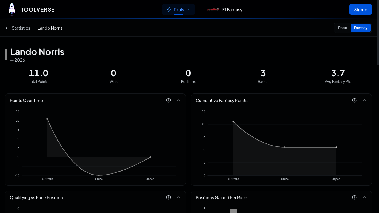
How to Use Points Trend Lines
The points trend line charts cumulative fantasy points over the season. A steep upward line means the driver is accumulating points quickly. A flat section means a scoring drought.
Comparing Two Drivers
Overlay two drivers' trend lines to compare their scoring rates directly. The steeper line is scoring faster. But pay attention to where the lines cross — a driver who starts slowly but accelerates past another is improving, while the one being overtaken is declining.
This is particularly useful for the value analysis described in our best value drivers guide. A driver whose trend line is steepening while their price stays flat represents an undervalued pick.
Spotting Scoring Plateaus
Flat sections in the trend line indicate races where the driver scored near-zero or negative. Check what caused each plateau:
- DNF: The -20 penalty creates a visible dip. One DNF doesn't indicate a form problem.
- Grid penalty: Starting from the back reduces qualifying points but may increase positions-gained points.
- Track weakness: If the plateau aligns with a specific track type, the driver may simply not suit certain circuits.
Understanding why the trend line flattened tells you whether to worry about future performance.
How to Read the Qualifying vs Race Scatter Plot
This chart plots qualifying position (x-axis) against race finishing position (y-axis) for every race the driver has completed. Each dot is one race. The diagonal line represents "finished where you started."
Interpreting Dot Positions
Dots below the diagonal: The driver finished higher than they qualified. They're a "race-day improver" — strong race pace, good starts, or clever strategy. These drivers score positions-gained bonuses regularly.
Dots above the diagonal: The driver finished lower than they qualified. They're a "qualifying specialist" who loses places on race day. These drivers may look good on Saturday but underdeliver on Sunday.
Tight cluster: The driver consistently qualifies and finishes in a narrow range. Predictable and consistent — you know what you're getting.
Wide scatter: Inconsistent results across different races. Higher variance means more uncertainty in predictions. Use the Apex Team Optimizer to account for this variance through Monte Carlo simulation.
Fantasy Application
Drivers whose dots cluster below the diagonal are excellent value picks because their race results exceed their grid position. This means they earn positions-gained bonuses on top of their race-finish points. A driver who qualifies P8 and typically finishes P5 earns +3 positions-gained points (3 points) on top of their race-finish points (10 for P5), totaling 13 from those categories alone.
How to Compare Teammates Head-to-Head
The teammate battle chart shows how often each driver outscores their teammate across the season. Since teammates drive the same car, any performance difference comes down to the drivers themselves, not the machinery.
What the Teammate Battle Reveals
The clear leader: If one driver outscores their teammate in 70%+ of races, they're simply the faster driver. In F1 Fantasy, the leading driver is usually worth the price premium over their teammate.
The even battle: If the split is 55/45 or closer, both drivers are similar performers. In this case, the cheaper teammate is usually the better F1 Fantasy pick. Same car, similar points, lower price = higher PPM.
The session-dependent split: Some teammates dominate qualifying but lose ground in races (or vice versa). If one consistently qualifies better but the other finishes races better, it might indicate different driving styles. The race-pace driver typically scores more total fantasy points because race points are worth more than qualifying points.
Beyond Win/Loss Ratio
Don't just look at how often each driver wins the battle. Look at the margin. A driver who wins 60% of teammate battles by 1-2 points each time is less dominant than one who wins 50% but by 10+ points when they do win. The margin tells you about upside potential.
The teammate comparison is especially useful when a team brings an upgrade. If one driver benefits more from the upgrade (their heatmap darkens while the teammate stays flat), that driver is extracting more from the new car and likely represents better value.
How to Use the Scoring Radar Chart
The radar chart breaks down a driver's fantasy points into component categories:
- Qualifying points
- Race position points
- Positions gained
- Overtakes
- Fastest lap
- Driver of the Day
Each axis shows the driver's average contribution from that category.
Reading the Shape
A balanced shape (relatively equal across all axes) means the driver scores from multiple sources. They're consistent because they don't rely on any single category.
A spiked shape (one or two dominant axes) means the driver scores heavily from specific categories. A spike on "overtakes" and "positions gained" indicates a recovery racer. A spike on "qualifying" and "race position" indicates a front-runner who starts high and stays high.
Matching Drivers to Tracks
Different tracks reward different scoring profiles:
- Monaco, Singapore, Hungary (low overtaking): Favor drivers with qualifying spikes. Positions are hard to gain on track, so grid position is almost everything.
- Bahrain, China, Spa (high overtaking): Favor drivers with overtaking and positions-gained spikes. Even a mid-grid start can yield plenty of scoring opportunities.
- Monza, Jeddah (power tracks): Favor drivers whose car excels on straights, as speed enables both qualifying performance and race-day overtaking.
Before each race, check the radar charts of your drivers against the upcoming track's characteristics. A driver with a qualifying-heavy radar at a high-overtaking track might underperform their season average.
How to Analyze Track-Type Performance
The track specialization breakdown shows how a driver performs across different circuit categories: street circuits, high-speed tracks, technical circuits, and mixed layouts.
Using Track Data for Selection
Some drivers are track-type specialists. They score well above average at one type of circuit and below average at others. These patterns are stable across seasons because they reflect driving style preferences.
Before each race:
- Identify the upcoming track's category
- Check which of your potential picks have the strongest scoring at that track type
- Rotate in drivers who specialize at the upcoming track type
- Rotate out drivers who historically struggle there
For example, a driver who averages 22 points at high-speed circuits but only 12 at street circuits should be on your team at Monza but possibly benched at Monaco.
The Apex Team Optimizer accounts for track characteristics in its predictions, but seeing the raw track-type data yourself helps you understand why the optimizer favors certain drivers at certain races.
How to Build a Statistical Pre-Race Routine
Here's a 5-minute routine to run before every team lock deadline:
Step 1: Check heatmaps (1 minute). Open driver profiles for your current team and 2-3 potential swaps. Are recent cells trending darker (good) or lighter (bad)?
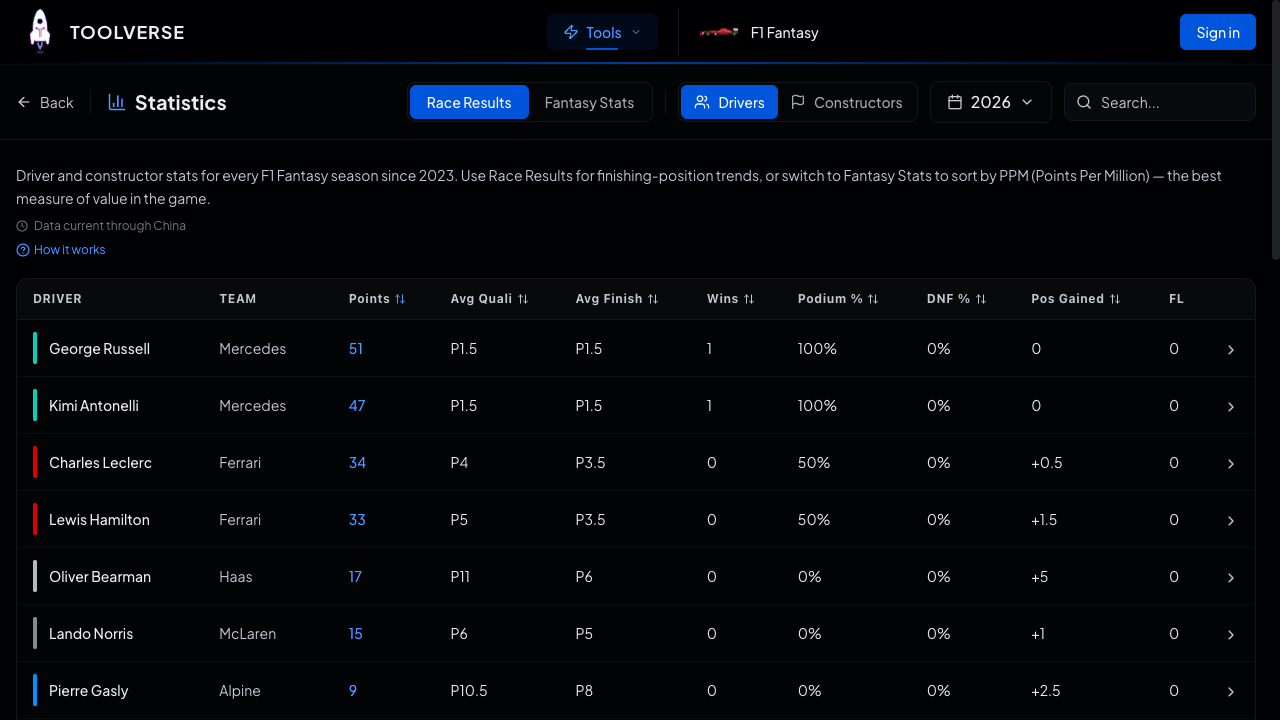
Step 2: Compare PPM (1 minute). Check the Statistics page PPM rankings. Is any of your drivers below the warning threshold for their price range? Is there a higher-PPM alternative at a similar price?
Step 3: Check track specialization (1 minute). What type of track is this weekend? Which of your drivers historically excel here? Which ones struggle?
Step 4: Review teammate battles (1 minute). For any driver pair where you own one teammate, check if the other teammate has recently started outperforming. A shift in the teammate battle often indicates a form change.
Step 5: Run the optimizer (1 minute). Open the Apex Team Optimizer and compare its top recommendation against your current team. If the optimizer ranks your team outside the top 50, consider making transfers.
This routine takes less time than watching a free practice highlights video and gives you data-driven confidence in your team selection.
Frequently Asked Questions
Can I compare drivers from different teams?
Yes. The Statistics page lets you view any driver's profile and mentally compare their charts. The PPM rankings on the main Statistics tab directly compare all 20 drivers regardless of team. For side-by-side comparison, open two driver profiles in separate browser tabs.
How far back should I look at stats?
For current-season decisions, focus on the last 5 races. This matches the effective "memory" of form-based prediction algorithms. Season-long stats are useful for identifying track specialists and overall capability, but recent form is more predictive of next-race performance.
Do these stats account for sprint weekends?
Yes. Sprint race results are included in the fantasy points totals shown on heatmaps and trend lines. Sprint-specific scoring appears in the per-race breakdowns on the Fantasy Points page.
Are constructor profiles useful for fantasy decisions?
Absolutely. Constructor profiles show teamwork bonus consistency (how often both drivers reach Q3), pit stop performance trends, and combined driver scoring. A constructor whose teamwork bonus is declining might have one driver underperforming, which affects both the constructor's and that driver's fantasy value.
How do I know if a pattern is real or just noise?
Look for patterns that persist across 4+ races. Any single-race outlier is likely noise (a DNF, a one-off penalty, a rain-affected race). But if a driver's heatmap shows 4-5 consecutive darker cells, that's a real form shift. Similarly, track-type patterns are more reliable when backed by 8+ races at that track type across multiple seasons.
Start Your Analysis
Data-driven team selection is the fastest path to competitive F1 Fantasy play. Explore the Statistics page for PPM rankings and driver profiles, run the Apex Team Optimizer to see how data translates to team recommendations, and check the Budget Boost page for price trend analysis. For the basics, read our beginner's guide.